Truly needless to say, people are going to interact with your website differently on your desktop compared to your mobile version. Taking a look at analytics that specifically compare your desktop to your mobile is important in knowing not only how differently it is, but it can help you makes steps to change the way you want people to navigate your site.
There are main purposes people businesses have websites, in general:
- Lead Generation
- Information on the Business (About, History, Prices)
- Information on their industry (Articles, Blogs, White Papers)
Think of your mobile site (which will be viewed mostly from a smart phone and less likely on a tablet) as a medium of presenting these purposes REALLY QUICKLY and as easily as possible. Obviously the difference between doing it on a 23 inch monitor and a 4 inch smart phone screen is going to be drastic.
That’s why it is important to know how your site is showing up differently and how this is directly affecting how people interact with your website – which is exactly what we’re going to discuss today!
Site Flow
Site flow (or behavior flow) is a handy way of knowing how people move through the site, and using filters, we can differentiate between the desktop and mobile traffic. Go to Google Analytics and under the “Behavior” tab on the left, select “Behavior Flow”.
Alone, this is already a great tool to see how people to the site and where they go from their initial landing page (including drop-offs which can be helpful information in regards to how you can push people to another page).
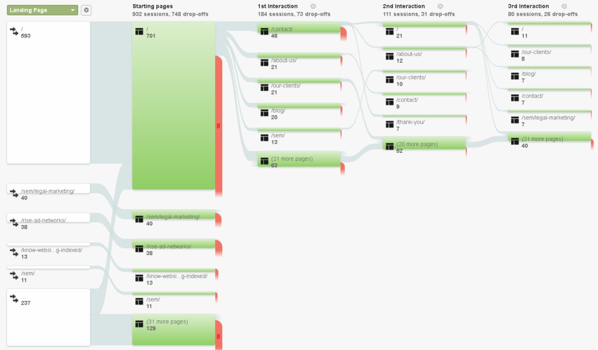
You can add interactions by clicking “step” at the right. Also the bottom boxes can be extended to see more pages in the flow.
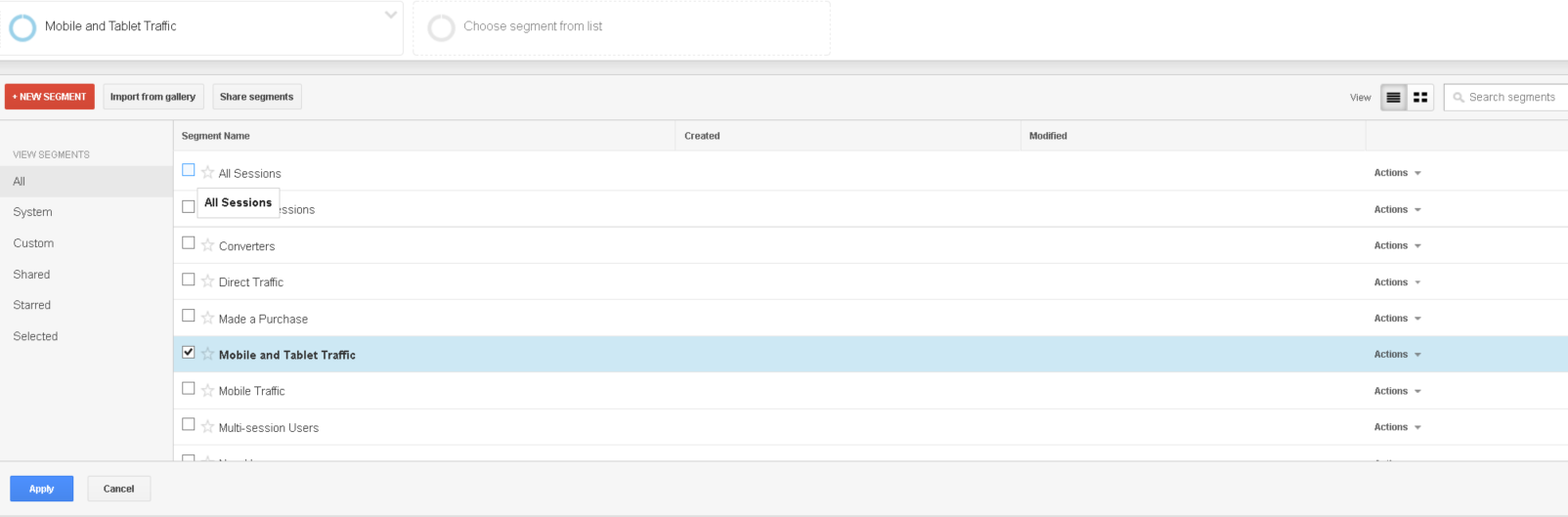
Now to compare to mobile, do the following:
- Click “All Sessions” above the flow chart
- Select “Mobile and Tablet Traffic” and uncheck “All Sessions”
It is pretty interesting how big the difference is for most websites….
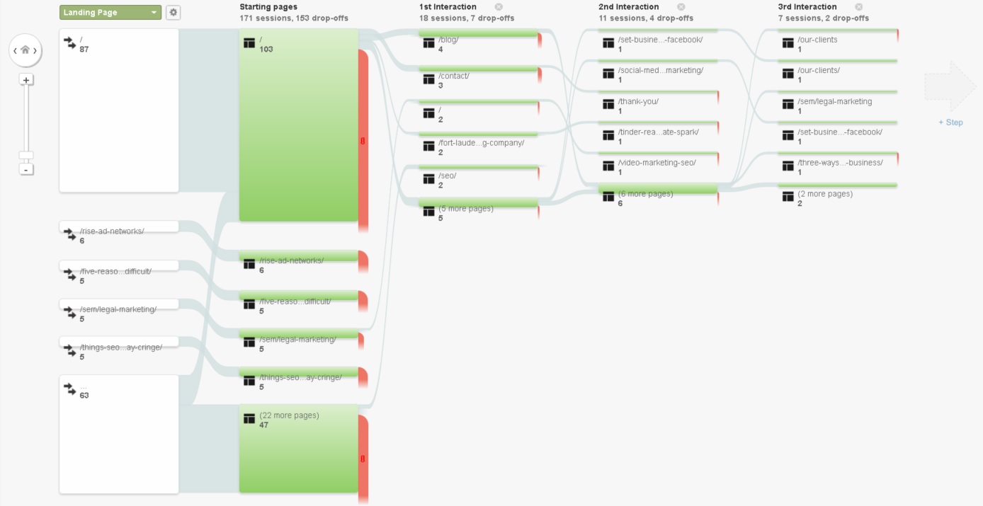
You may look at your flow chart and think “Crap, on my desktop that’s great that the first page they go to from hoping on the site is my contact (since I have a lead generation-centric website” but from my mobile it goes to my freaking blog?! Oh man we have to do something about that”.
If you identify that people are utilizing your site in a less desirable fashion on mobile, there are options – if you have a dedication m. website, you can simply move links/CTAs to a higher more prominent position on the site. If the site is responsive and on the same domain, you can let your webmaster know to do some handy work with JavaScript or CSS that will trigger depending on the screen resolution of the browser. Even many WordPress plugins may be able to assist with a call to action that activates for a mobile visitor.
Need help making your mobile site perform as well as your desktop site? We know the struggle! Contact us today and let’s talk about what we can do.

MMM Author Ryan Klein
The ongoing digital revolution is transforming the way that all businesses interact with clients and customers. Consumers rely heavily on digital channels for researching products and services and expect to make buying choices with the swipe of a finger. For organizations that want to remain competitive, having a defined digital marketing strategy and execution plan is essential for successful outcomes. With a demonstrated history of creating and implementing strategic digital marketing initiatives that drive growth, I am committed to delivering real, measurable results for my clients.